
Entertainment / Brand launch
Thunderhead Pyrotechnics
A new pyrotechnics brand built for launch.
Logo, brand guidelines, and website direction built around cinematic show imagery.

01 / The brief
A bold identity.
A bigger first impression.
Thunderhead needed a distinctive brand and a clear direction for presenting its fireworks shows. The identity had to hold its own alongside dramatic show imagery.
MarketWorth connected the logo, brand guidelines, and website concept around a consistent visual direction.
The brand palette
Dark foundation.
Electric detail.
Black sets the stage. Blue adds energy. Silver and white keep the identity crisp.
02 / The website direction
Let the show
lead the story.
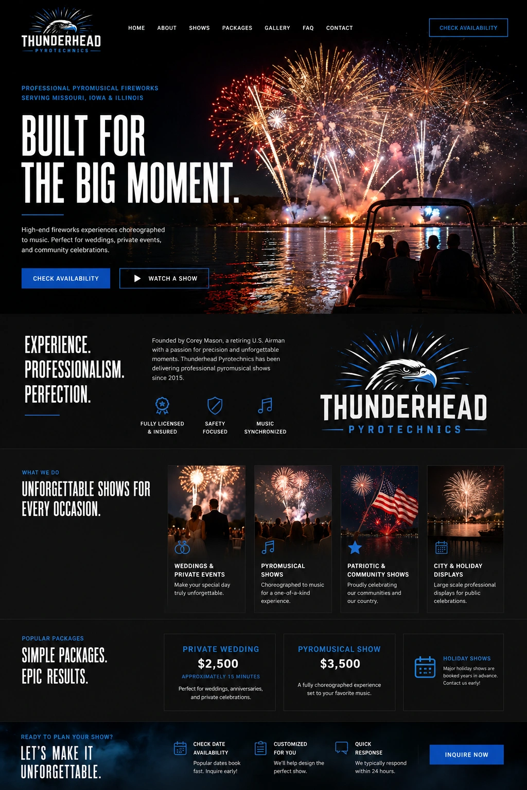
The website mockup pairs cinematic fireworks imagery with strong type, dark surfaces, and blue accents. The logo, navigation, and calls to action share the same visual language, giving the company a clear way to introduce its shows.
03 / The brand in use
From the screen
to the sweatshirt.
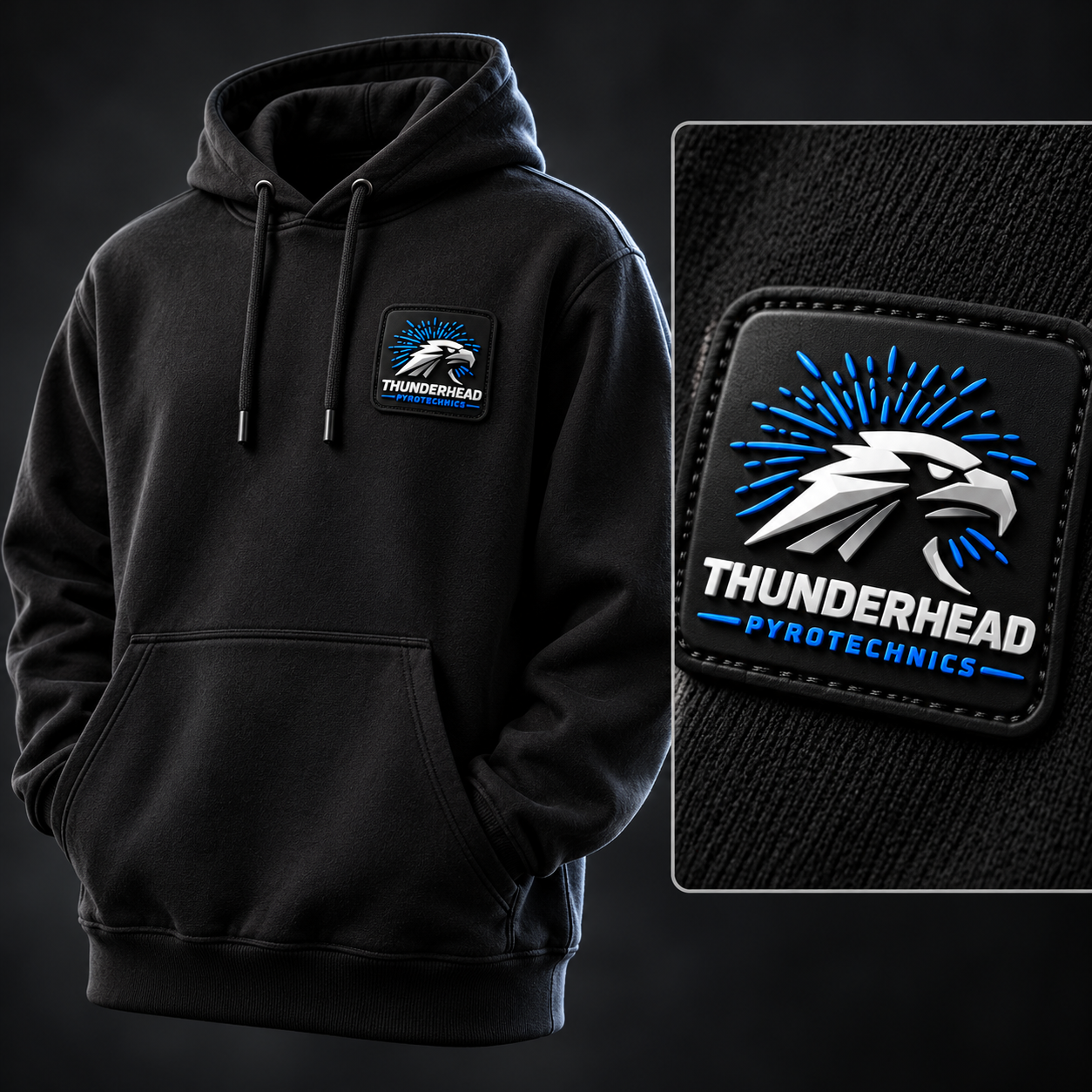
The black hoodie carries the identity into apparel with a raised PVC patch. The eagle, blue bursts, and silver lettering give the mark texture while keeping the palette consistent.
One focused merchandise concept shows how the same identity can work beyond the website.
The finished direction
One identity.
Across every appearance.
Logo, color, website direction, and apparel concepts—connected by the same bold visual language.
Project scope
- Logo design
- Brand guidelines
- Website design direction
Your next project
Ready to build something of your own?
Let’s discuss the work that would move your business forward.
Book a discovery call →