
Agriculture / Brand identity
Minear Seed Services
A clear identity from day one.
Logo design and brand guidelines for a new agricultural business.

01 / The brief
A new business.
An identity rooted in agriculture.
Minear needed a recognizable identity and clear guidance for putting it to work. The goal was a brand that felt at home in the agricultural community, from the first introduction to everyday apparel.

Deep green. Fresh growth.
Harvest gold.
02 / The visual language
From the seed
to the season.
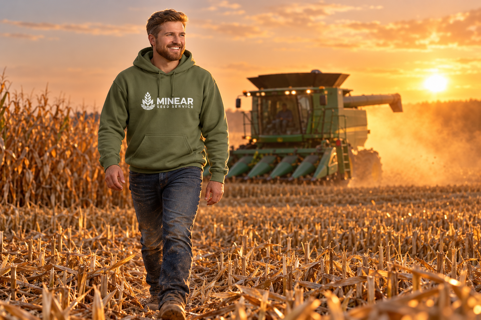
The seed-and-field symbol anchors the identity. Deep green gives it weight, brighter green suggests growth, and gold brings warmth to the palette.
That same direction carries into the imagery: green apparel against a golden harvest. The brand feels connected whether it appears on a logo, a cap, or a sweatshirt.
03 / Apparel & brand assets
Made to wear.
Easy to recognize.
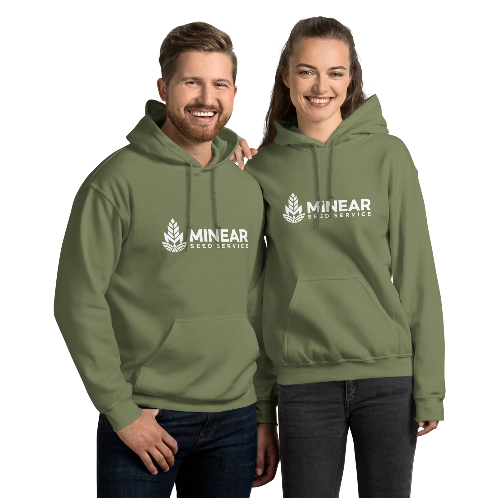
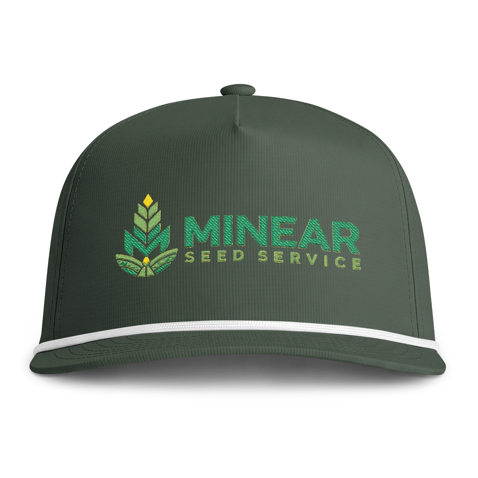
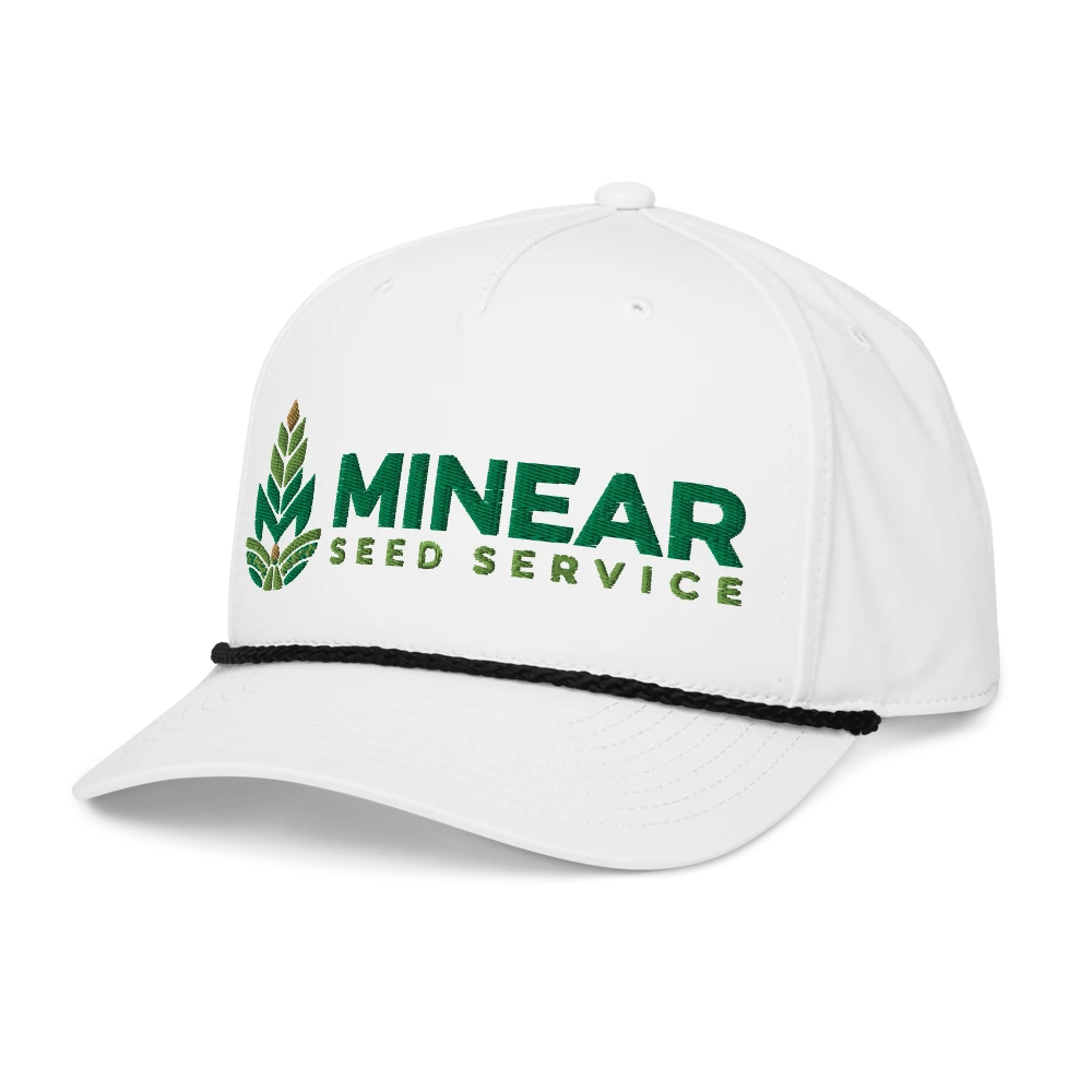
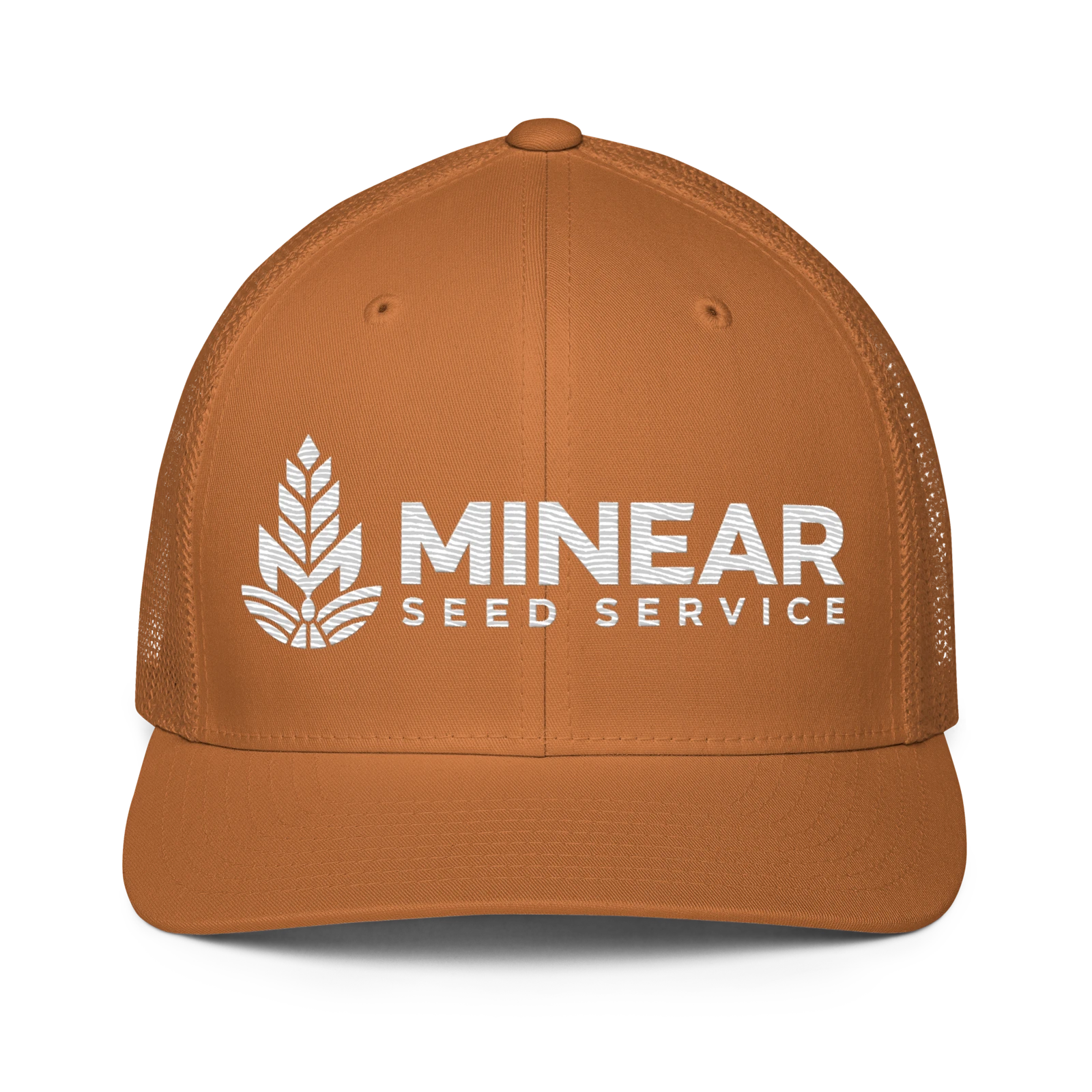
A focused selection keeps the identity consistent: green sweatshirts and green, white, and tan caps. The full logo and its white variation give the brand a clear presence across light and dark materials.
The guidelines connect color, logo placement, and everyday use so each piece feels like part of the same business.
The finished work
One identity.
Ready for everyday use.
A distinctive logo, a grounded color palette, and practical brand guidelines—brought together across a small, consistent set of apparel concepts.
Project scope
- Logo design
- Visual brand identity
- Brand guidelines
Your next project
Ready to build something of your own?
Let’s discuss the work that would move your business forward.
Book a discovery call →